


What Makes a Good Abstract Painting: Key Qualities
TL;DR:
- Good abstract paintings are deliberate and communicate purpose through every brushstroke and color choice.
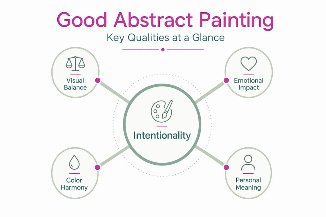
- Visual balance, emotional impact, and purposeful relationships between shapes define high-quality abstract art.
- Artists should trust their work and embrace abstract art’s openness to multiple interpretations and personal meaning.
Most people assume abstract paintings are random. They look at a canvas covered in bold sweeps of color and think anyone could have done it. That assumption is exactly wrong. Understanding what makes a good abstract painting means recognizing that every brushstroke, every color choice, and every area of visual tension is deliberate. Abstract art has its own visual language, and once you learn to read it, these works stop feeling mysterious and start feeling like direct communication. This guide covers the qualities, principles, and techniques that separate compelling abstract paintings from forgettable ones.
Table of Contents
- Key takeaways
- What makes a good abstract painting: intentionality and visual vocabulary
- Visual balance and compositional principles
- Emotional impact and how viewers connect
- Practical techniques for aspiring abstract painters
- My perspective on what separates memorable abstract work
- Explore original abstract art at Emansgallery
- FAQ
- Stay Connected
Key takeaways
| Point | Details |
|---|---|
| Intentionality defines quality | Every mark, color, and shape in a strong abstract painting serves a communicative purpose, not just decoration. |
| Visual balance signals completion | Well-distributed visual weight keeps the viewer’s eye moving and signals a finished, coherent work. |
| Emotional impact is the goal | Good abstract art evokes a genuine response, with color pairings and composition creating specific moods. |
| Overworking is a real risk | Knowing when to stop is a skill. Breaks and the squinting method help painters assess and protect earlier success. |
| Multiple interpretations are a strength | Abstract art’s power comes from inviting personal meaning, not delivering a single fixed message. |
What makes a good abstract painting: intentionality and visual vocabulary
The single most important quality separating a compelling abstract painting from a random collection of marks is intentionality. Abstract art is not random. Every brushstroke, color selection, and textural element is a deliberate decision that contributes to a larger visual conversation.
Think of it this way. A painter chooses a wide, aggressive stroke to create tension. A soft, curved line introduces calm. A dense texture in one corner adds visual weight that must be balanced elsewhere. These are not accidents. They are the vocabulary of abstract painting, and understanding this is the foundation of knowing what makes abstract art good.
Here is what that visual vocabulary typically includes:
- Line quality. A jagged, broken line communicates anxiety or energy. A slow, flowing line suggests ease or movement. The quality of a line shapes mood before the viewer consciously processes it.
- Shape relationships. How shapes relate to one another, overlapping, contrasting, or echoing, creates visual dialogue. Artists manage these relationships to build coherence.
- Texture and surface. Thick impasto areas pull the eye differently than smooth, washed passages. Texture adds a tactile dimension that engages viewers on a sensory level.
- Color as expression. Color creates emotional environments: red paired with black feels aggressive or violent, while red paired with yellow feels festive and energetic. The importance of color in abstract art cannot be overstated.
Understanding the fundamental concepts behind abstraction helps both viewers and artists recognize when marks are working together purposefully versus just filling space.
Pro Tip: Before you start a new abstract piece, write one sentence describing the feeling or idea you want the work to communicate. Refer back to it each time you pick up your brush. This keeps your marks intentional rather than decorative.
Visual balance and compositional principles
A good abstract painting achieves balance. Not necessarily symmetry. Balance in abstract art means visual weight is distributed so that the viewer’s eye can travel comfortably across the entire surface without getting stuck or falling off an edge.
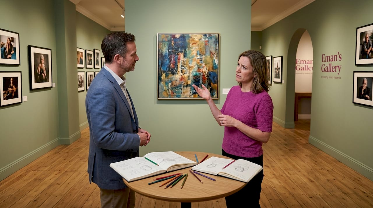
Visual balance is a key indicator of when an abstract painting is finished. An area of heavy texture in one section, for example, demands a corresponding point of interest somewhere else. Without that counterweight, the composition feels unresolved.
Recent research adds a compelling scientific dimension to this. Mathematicians identified a “golden rule” for shape placement in abstract art that aligns with how viewers naturally experience visual balance. Abstract artists consistently position shapes according to a ratio that AI-generated art lacks entirely. This suggests that skilled human painters follow a structural intuition that produces compositions the eye finds satisfying at a level below conscious thought.
Here is a practical breakdown of balance concepts worth knowing:
| Balance Type | What It Looks Like | Why It Works |
|---|---|---|
| Symmetrical | Mirror-image composition | Creates calm, formality, stability |
| Asymmetrical | Uneven but weighted correctly | Feels dynamic while remaining resolved |
| Radial | Elements moving outward from a center | Draws the eye inward, creates energy |
| Color-based | Heavy dark areas offset by bright, light regions | Manages visual weight through tone |
Overworking is one of the most common ways balance gets disrupted. Continuing to add marks without clear purpose often covers up earlier sections that were already working. The painting loses the coherence it had.
Pro Tip: Step back and squint at your canvas until details blur. What you see at that point are pure shapes, values, and weight distribution. If one area dominates uncomfortably or the canvas feels empty in a specific zone, you have found the compositional problem.
Emotional impact and how viewers connect
Abstract art does not tell a story the way a portrait or landscape does. Its meaning comes from a different place: personal association, emotional response, and the psychological effects of color and form. The biggest misconception about abstract art is that it is meaningless. In reality, viewers bring their own experiences to the work, and those experiences become part of the meaning.
This is precisely what makes authenticity so critical when evaluating or creating abstract art. A painter who works from genuine feeling or a clear internal vision produces work that carries that energy. Viewers sense the difference between a painting made with conviction and one that was made purely to look like art.
High quality abstract art evokes strong emotions and communicates ideas or beliefs without relying on recognizable subject matter. The emotional environment is built through deliberate choices rather than luck. To learn how emotional depth functions in abstract work, it helps to look closely at how different abstract styles engage viewers differently:
- Gestural abstraction. Energetic, expressive marks invite viewers to feel the physical act of painting. Think raw movement and urgency.
- Color field painting. Large areas of flat or blended color create meditative, immersive experiences. The emotion is quieter but no less powerful.
- Geometric abstraction. Precise shapes and formal relationships engage the intellect. The emotion is often about order, tension, or harmony.
Each abstract style suggests a different viewing strategy. Recognizing which style a painting operates within helps viewers access its emotional register more readily. It also helps aspiring painters choose an approach that suits what they actually want to communicate.
Abstract art’s strength comes from its ability to create multiple valid interpretations rather than delivering a single fixed message. This open quality is not a weakness. It is the feature that keeps viewers returning, finding new meanings each time.
Practical techniques for aspiring abstract painters
Knowing the qualities of good abstract art is useful. Knowing how to apply them in your own studio practice is what moves the work forward. The following process-based tips address the areas where most aspiring abstract painters struggle.
-
Set your intention before you begin. Decide what mood, feeling, or idea you are working toward. This does not mean planning every mark. It means having a direction so your decisions feel purposeful rather than arbitrary.
-
Start with large marks and major color areas. Working big before working small keeps you focused on overall composition and balance. Details added too early compete with structure before structure exists.
-
Use the squinting method throughout the process. Squinting reveals whether shapes and colors hold as a unified composition by stripping away distracting detail. Do this at every stage, not just at the end.
-
Take timed breaks. Fresh eyes catch problems that tired eyes miss. Walk away for 20 minutes and return. What bothers you immediately is the area to address.
-
Develop your own finishing criteria. Professional abstract artists develop personalized standards for knowing when a work is complete, combining objective compositional checks with refined intuition built over time. Start building yours now by writing down what “done” looked like for each completed painting.
-
Experiment with deliberate restraint. Abstract does not mean more is better. Some of the most powerful abstract works succeed through what is left out. Negative space has weight, mood, and meaning.
Pro Tip: When you feel the urge to keep adding, photograph the painting first. Comparing the photo to what you are about to do forces a conscious decision rather than a reflexive one. Many painters discover they were finished three steps ago.
Evaluating your own work benefits from the same criteria you would apply when assessing collectible art quality: intentionality, originality, compositional strength, and emotional resonance.
My perspective on what separates memorable abstract work
I’ve spent years making abstract paintings and just as many years looking at them. The lesson that took longest to accept is this: the work does not need to be understood to be effective. I used to second-guess pieces that felt resolved to me but resisted explanation. That doubt cost me a lot of strong paintings.
What I’ve learned is that viewers do not need a narrative. They need to feel something. When a painting is genuinely finished, meaning when the balance, color, and marks are all working together, something shifts. The surface stops being a collection of decisions and starts behaving like a single object. That is the moment to stop.
I’ve also learned that overworking is almost never about adding one more thing. It is about not trusting what is already there. The instinct to keep going is almost always anxiety, not creative necessity. The best thing I ever did for my practice was build in a rule: if I cannot explain exactly what a new mark will add, I do not make it.
The other thing nobody tells you early enough is how much freedom lives in the viewer’s experience. A piece I made thinking about water became, for one collector, an image of grief. Another saw growth. Both were right. Abstract art’s open meaning is not a limitation. It is the point.
— Eman
Explore original abstract art at Emansgallery
Understanding what makes a good abstract painting becomes even clearer when you see these principles at work in real pieces.
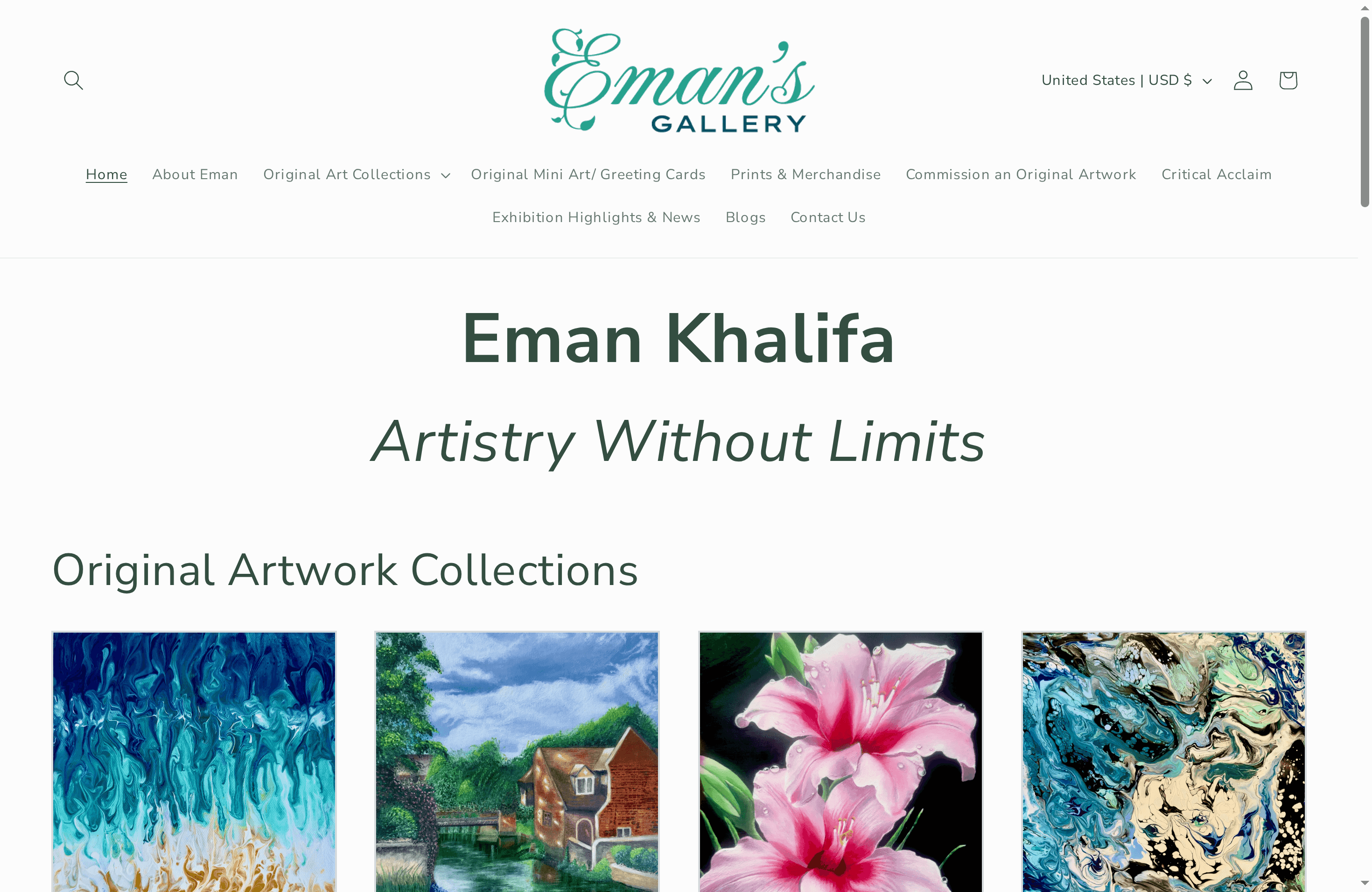
At Emansgallery, each original painting by Eman Khalifa demonstrates deliberate mark-making, visual balance, and genuine emotional intent. The Good Tidings original painting is a strong example: fluid blue and gold forms that carry both structural balance and a distinct emotional atmosphere. For those drawn to depth and color tension, the Mystic Sea original shows how composition and color pairing create a meditative, immersive experience. Museum-quality canvas prints make it possible to bring these qualities into any space worldwide. Paintings that illustrate what good abstract art can do are available to view now at emansgallery.com.
FAQ
What makes a painting abstract?
A painting is abstract when it does not directly represent real-world objects or figures. It uses color, shape, line, and texture as its primary visual language instead of depicting recognizable subjects.
How do you evaluate abstract paintings?
Evaluate abstract paintings by assessing visual balance, intentionality of marks, emotional impact, and compositional coherence. Squinting at the canvas to see pure values and shapes is a reliable method for judging overall structure.
What role does color play in abstract art?
Color is one of the most powerful tools in abstract art. Specific color pairings create distinct emotional responses: red and black feel aggressive, while softer blues and golds create calm or contemplation. The importance of color in abstract art is that it sets the entire emotional environment of the work.
What are the key characteristics of good abstract art?
Good abstract art is intentional, emotionally resonant, visually balanced, and open to personal interpretation. It avoids being purely decorative by ensuring every element contributes to the work’s overall expression and meaning.
Can abstract art have multiple meanings?
Yes. Abstract art invites multiple valid interpretations rather than delivering a single fixed message. This capacity for open meaning is one of its defining strengths, not a flaw.
Stay Connected
-
✨ Explore Eman Khalifa’s original art, fine art prints & art merchandise
-
Follow Eman Khalifa’s art journey on: Instagram @emans_gallery and Facebook Eman’s Gallery
-
Watch Eman Khalifa creating live art on: YouTube @emans_gallery
-
Supported by BabyLoveGrowth
